TWiki Variables » Search » Category: Formatting & Rendering
Variables in this category:
- BUBBLESIG -- show bubble box and user signature with profile picture icon
- COLORPICKER{} -- color picker for use in HTML forms for TWiki applications
- COPY -- Copyright symbol
- DASHBOARD -- build a dashboard with banner and boxes
- DATEPICKER{} -- pop-up calendar to select a date for use in HTML forms
- ENDBG -- end background color section
- ENDCOLUMNS -- end a responsive multi-column page layout
- ENTITY{string} -- encode a string to HTML entities
- FORM{} -- render a TWiki form for view
- FOURCOLUMNS -- responsive four-column page layout
- HIDE{text} -- hide content in topic view
- HIDEINPRINT{text} -- hide content when printing
- JQENDTAB -- end a JQuery tab within a tab pane
- JQENDTABPANE -- end a JQuery tab pane
- JQTAB -- start a JQuery tab within a tab pane
- JQTABPANE -- start a JQuery tab pane
- LAQUO -- left double angle quote
- NBSP -- non-breaking space
- PARENTBC -- parent breadcrumbs for headings
- RAQUO -- right double angle quote
- REDBG -- start red colored background section
- REG -- Registered Trademark symbol
- THREECOLUMNS -- responsive three-column page layout
- TM -- Trademark symbol
- TWIKISHEET{} -- enable TWiki Sheet (spreadsheet) and set options
- TWISTY{ attributes } -- dynamically open and close sections of content
- TWOCOLUMNS -- responsive two-column page layout
- USERSIG -- show user signature with profile picture icon
- WIP -- work in progress icon
BUBBLESIG -- show bubble box and user signature with profile picture icon
- Syntax:
%BUBBLESIG{WikiName}%or%BUBBLESIG{WikiName - YYYY-MM-DD}% - The parameter can be either just the WikiName of a user, or by convention the WikiName followed by a dash and the date
- Example:
-- %BUBBLESIG{TWikiGuest - 21 May 2026}% - Expands to:
-- %BUBBLESIG{TWikiGuest - 21 May 2026}% - Category: EditingAndContentUpdateVariables, FormattingAndRenderingVariables, UsersAndAuthenticationVariables
- Related: USERREPORT, USERSIG, UserList, UserReports (this topic)
COLORPICKER{} -- color picker for use in HTML forms for TWiki applications
- The
%COLORPICKER{}%variable is handled by the ColorPickerPlugin. - Syntax:
%COLORPICKER{ name="..." value="..." }% - Parameters:
Parameter Description 
Default Example Additional parameters can be supplied; they will be added to the HTML input field or the rectangular color block. classCSS class of input field or the rectangular color block (none) class="twikiInputField"valueInitial color value, in hexadecimal notation for the combination of Red, Green, and Blue color values (RGB). (none) value="#0000ff"nameName of input field (required) name="text_color"sizeSize of input field, in number of characters (browser default) size="8"styleStyle of input field or the rectangular color block (none) style="width: 190px; height: 32px"typeType of color widget:
â\x{fffd}¢"below"- color picker is located below the input field;
â\x{fffd}¢"popup"- pop-up a color picker window when clicking the button next to the input field
(this uses very little vertical space);
â\x{fffd}¢"view"- a read-only rectangular block colored in the color value (no color picker);
â\x{fffd}¢"view-hex"- likeview, in addition shows the color value as an RGB hexadecimal code (no color picker);type="below"type="view-hex" - Example:
<form action="...">
%COLORPICKER{ name="text_color" value="#123456" class="twikiInputField" type="popup" }%
<form>
Renders as:
- Category: ApplicationsAndComponentsVariables, DatabaseAndFormsVariables, EditingAndContentUpdateVariables, FormattingAndRenderingVariables, UIAndVisualizationVariables
- Related: ColorPickerPlugin, TWikiForms (this topic)
COPY -- Copyright symbol
- Type: Preference variable - TWikiRenderingShortcut.
- Syntax:
%COPY% - Expands to: %COPY%
- Category: FormattingAndRenderingVariables
- Related: BB, BB2, BB3, BB4, BR, BULLET, LAQUO, NBSP, PARENTBC, RAQUO, REG, TM, VBAR, TWikiPreferences rendering shortcuts (this topic)
DASHBOARD -- build a dashboard with banner and boxes
- Use this variable to quickly create dashboards for intranet home, team homepages, project homepages and knowledge bases. See the TWikiDashboardAddOn for details on enabling and using the
%DASHBOARD{...}%variable. - Syntax:
%DASHBOARD{ section="..." ... }% - Example:
%DASHBOARD{ section="dashboard_start" }%
%DASHBOARD{ section="banner" image="..." title="..." }%
%DASHBOARD{ section="box_start" title="Box 1 title" }%
Box 1 content
%DASHBOARD{ section="box_end" }%
%DASHBOARD{ section="box_start" title="Box 2 title" }%
Box 2 content
%DASHBOARD{ section="box_end" }%
...
%DASHBOARD{ section="dashboard_end" }% - Category: AdministrationVariables, ApplicationsAndComponentsVariables, DevelopmentVariables, FormattingAndRenderingVariables, UIAndVisualizationVariables
- Related: TWikiDashboardAddOn (this topic)
DATEPICKER{} -- pop-up calendar to select a date for use in HTML forms
- The
%DATEPICKER{}%variable is handled by the DatePickerPlugin. - Syntax:
%DATEPICKER{ name="..." value="..." }% - Parameters:
Parameter Description Default Example nameName of input field.
φ: No output is shown if the name parameter is missing, but the CSS and Javascript are loaded.(requiredφ) name="Start"valueInitial date value. ""(today)value="2012-12-31"formatFormat of resulting date value.
â\x{fffd}¢%a- abbreviated weekday name
â\x{fffd}¢%A- full weekday name
â\x{fffd}¢%b- abbreviated month name
â\x{fffd}¢%B- full month name
â\x{fffd}¢%C- century number
â\x{fffd}¢%d- the day of the month (00 ... 31)
â\x{fffd}¢%e- the day of the month (0 ... 31)
â\x{fffd}¢%H- hour (00 ... 23)
â\x{fffd}¢%I- hour (01 ... 12)
â\x{fffd}¢%j- day of the year ( 000 ... 366)
â\x{fffd}¢%k- hour (0 ... 23)
â\x{fffd}¢%l- hour (1 ... 12)
â\x{fffd}¢%m- month (01 ... 12)
â\x{fffd}¢%M- minute (00 ... 59)
â\x{fffd}¢%n- a newline character
â\x{fffd}¢%p- "PM" or "AM"
â\x{fffd}¢%P- "pm" or "am"
â\x{fffd}¢%S- second (00 ... 59)
â\x{fffd}¢%s- number of seconds since Epoch (since Jan 01 1970 00:00:00 UTC)
â\x{fffd}¢%t- a tab character
â\x{fffd}¢%U,%W,%V- the week number. The week 01 is the week that has the Thursday in the current year, which is equivalent to the week that contains the fourth day of January. Weeks start on Monday.
â\x{fffd}¢%u- the day of the week (1 ... 7, 1 = MON)
â\x{fffd}¢%w- the day of the week (0 ... 6, 0 = SUN)
â\x{fffd}¢%y- year without the century (00 ... 99)
â\x{fffd}¢%Y- year including the century (ex. 2012)
â\x{fffd}¢%%- a literal%character"%Y-%m-%d"format="%e %b %Y"idID of input field, optional. "id_"+ nameid="idStart"sizeSize of input field, in number of characters. (calculated as needed) size="12"classCSS class of input field. "twikiInputField"class="dateField"Additional HTML input field attributes, such as alt,disabled,maxlength,onblur,onchange,onfocus,readonly,style,tabindex,title - Example:
<form action="...">
%DATEPICKER{ name="Start_Date" }%
<form> - Expands to:
- Category: ApplicationsAndComponentsVariables, DatabaseAndFormsVariables, DateAndTimeVariables, EditingAndContentUpdateVariables, FormattingAndRenderingVariables, UIAndVisualizationVariables
- Related: DatePickerPlugin, TWikiForms (this topic)
ENDBG -- end background color section
-
ENDBGis a rendering shortcut settings predefined in TWikiPreferences. See the section rendering shortcut settings in that topic for a complete list of background colors. - Syntax:
%REDBG% red background %ENDBG% - Expands to: %REDBG% red background %ENDBG%
- Note:
%<color>BG%section must end with%ENDBG%. If you want to switch from one background color to another one you first need to end the active background color with%ENDBG%, such as%REDBG% some text %ENDBG% %GREENBG% more text %ENDBG%. - Category: FormattingAndRenderingVariables
- Related: VarENDCOLOR, VarREDBG, TWikiPreferences rendering shortcuts, StandardColors (this topic)
ENDCOLUMNS -- end a responsive multi-column page layout
- Write
%TWOCOLUMNS% ...text... %ENDCOLUMNS%to get a page layout with two columns. See TWOCOLUMNS, THREECOLUMNS, FOURCOLUMNS. - Syntax:
%TWOCOLUMNS% ... %ENDCOLUMNS% - Type: Preference variable - TWikiRenderingShortcut.
- Category: FormattingAndRenderingVariables
- Related: TWOCOLUMNS, THREECOLUMNS, FOURCOLUMNS, TWikiPreferences rendering shortcuts (this topic)
ENTITY{string} -- encode a string to HTML entities
- Encode "special" characters to HTML entities. Useful to encode text properly for HTML input fields.
- Encoded characters:
- all non-printable ASCII characters below space, including newline (
"\n") and linefeed ("\r") - Space
- HTML special characters
"<",">","&", single quote (') and double quote (") - TWiki special characters
"%","[","]","@","_","*","="and"|"
- all non-printable ASCII characters below space, including newline (
- Syntax:
%ENTITY{string}% - Example:
%ENTITY{text with "quotes" andexpands to
newline}%text with "quotes" and newline - Notes:
- To protect against cross-site scripting
 (XSS), always entity encode text intended for HTML input fields. This is especially true if text is received dynamically via URLPARAM or the like.
Example:<input type="text" name="address" value="%ENTITY{any text}%" /> -
%ENTITY{string}%is roughly equivalent to%ENCODE{ "string" type="html" }%, but the latter cannot handle strings that have double quotes embedded in it.
- To protect against cross-site scripting
- Category: DevelopmentVariables, FormattingAndRenderingVariables, ExportAndPublishingVariables
- Related: ENCODE, FORMFIELD, QUERYPARAMS, URLPARAM (this topic)
FORM{} -- render a TWiki form for view
- Show a table containing data of a TWiki form attached to a topic
- Syntax:
%FORM{topic="..." formfields="..." ...}% - Supported parameters:
Parameter: Description: Default: "..."or
topic="..."Name of topic containing the TWiki form, such as "Bug1234". Specify topic name orWeb.TopicNameCurrent topic rev="..."Get the form from the specified topic revision, range "1"to top revision of topic."0"is equivalent to the top revisionThe revURL parameter value if present, else the top revisionformfields="..., ..."Specify names of TWiki form fields to show, in sequence. The alltoken shows all remaining fields."all"header="..."Form header, typically containing the form name. If "on", the default format"*[[$formweb.$formtopic][$formtopic]]* " is used. If "none", the header is suppressed. Supported variables:
â\x{fffd}¢$formweb- name of web containing the form definition.
â\x{fffd}¢$formtopic- name of topic containing the form definition."on"format="..."Format of one form field. Supported variables:
â\x{fffd}¢$title- raw field name (includes space and other special characters).
â\x{fffd}¢$name- field name (sanitized title).
â\x{fffd}¢$type- form field type.
â\x{fffd}¢$size- size of field or selector.
â\x{fffd}¢$value- form field value.
â\x{fffd}¢$value(20, -<br />)- value hyphenated every 20 characters using separator -<br />.
â\x{fffd}¢$value(30, ...)- value shortened to 30 characters.
â\x{fffd}¢$length- length of form field value.
â\x{fffd}¢$tooltip- tooltip message.
â\x{fffd}¢$attributes- type attributes, such as H for hidden, M for mandatory.
â\x{fffd}¢$formweb- name of web containing the form definition.
â\x{fffd}¢$formtopic- name of topic containing the form definition.
See details in TWikiForms#FormFieldTypes."$title: $value " separator="..."Line separator. Variable $brexpands to<br />tag, and$nto a newline."$n"default="..."Text shown when no form or form fields are found ""newline="$br"Convert newlines in textarea to other delimiters. Variable $brexpands to<br />tag, and$nto a newline. Other text is encoded based onencodeparameter."$br"if format is a TWiki table, else"\n"encode="html"Encode special characters in form field value into HTML entities. Additional encodings available: encode="quote",encode="moderate",encode="safe",encode="entity"andencode="url". See ENCODE for details.""(no encoding)showhidden="..."Set to "on"to show also hidden form fields."" - Examples:
-
%FORM{topic="%INCLUDINGTOPIC%"}%- show form data of the including topic (typically used in an included header) -
%FORM{topic="Projects.SushiProject" formfields="Title, Status, Deadline" header="none"}%- show a subset of form fields -
%FORM{format="$name" header="none" separator=", "}%- get all visible form field names as a list
-
- Category: DatabaseAndFormsVariables, DevelopmentVariables, FormattingAndRenderingVariables
- Related: EDITFORM, EDITFORMFIELD, ENCODE, ENTITY, FORMFIELD, META, METASEARCH, SEARCH, TWikiForms, FormattedSearch, QuerySearch, SearchHelp (this topic)
FOURCOLUMNS -- responsive four-column page layout
- Write
%FOURCOLUMNS% ...text... %ENDCOLUMNS%to get a page layout with four columns. The layout is responsive, e.g. it automatically adjusts to a lower number of columns (4 => 3 => 2 => 1) depending on the window width or screen width of the device used. The 300 pixels minimum width of a column determines the number of columns shown. Embedded images scale down automatically to the width of the screen if needed. - Syntax:
%FOURCOLUMNS% ... %ENDCOLUMNS% - Example: %FOURCOLUMNS% Lorem ipsum dolor sit amet, consectetur adipiscing elit. Sed viverra ante ac augue sagittis semper. Vestibulum sed urna quam. Phasellus eleifend dolor id dui dictum lobortis. Etiam enim erat, fermentum eget libero non, pretium vestibulum nisi. Nam eget nisi diam. Cras egestas, nibh a malesuada hendrerit, tellus turpis gravida dolor, at fermentum ipsum libero id eros. Mauris a nunc turpis. Fusce turpis dui, blandit nec maximus at, sagittis et arcu. Duis eros sapien, accumsan sed varius eget, elementum eu sapien. Nulla congue, nulla efficitur gravida porta, leo ex feugiat purus, sit amet sagittis leo arcu at magna. Pellentesque eleifend, libero quis consectetur tincidunt, orci ipsum scelerisque turpis, vulputate feugiat risus orci non odio. Integer id enim turpis. Cras et nisl quis massa ornare maximus id sit amet justo. Mauris at mi eget nisi imperdiet ullamcorper. %ENDCOLUMNS%
- Type: Preference variable - TWikiRenderingShortcut.
- Category: FormattingAndRenderingVariables
- Related: TWOCOLUMNS, THREECOLUMNS, ENDCOLUMNS, TWikiPreferences rendering shortcuts (this topic)
HIDE{text} -- hide content in topic view
- Text inside the HIDE is removed when viewing the topic. This can be used to remove large amounts of text from being sent to the browser, such as the user list in Main.TWikiUsers if there are many thousands of users.
- Syntax:
%HIDE{ any text }% - Expands to: (empty string)
- Notes:
- Using HIDE is not a replacement for access control, because edit and raw view still show the content.
- Variables inside HIDE still get expanded because variables execute inside out, e.g. you can't use it to speed up slow variables.
-
<!-- HTML comments -->also hide content from the user, but unlike HIDE, HTML comments are sent to the browser.
- Category: FormattingAndRenderingVariables
- Related: HIDEINPRINT, NOP, STARTSECTION (this topic)
HIDEINPRINT{text} -- hide content when printing
- Text inside the HIDEINPRINT is omitted when printing a topic.
- Syntax:
%HIDEINPRINT{ any text }% - Expands to:
any textin topic view, or empty string in printout - Category: FormattingAndRenderingVariables
- Related: HIDE, NOP (this topic)
JQENDTAB -- end a JQuery tab within a tab pane
- This variable is handled by the JQueryPlugin. For description see JQTABPANE
- Syntax:
%JQTABPANE% %JQTAB{"Tab 1"}% ... %JQENDTAB% %JQTAB{"Tab 2"}% ... %JQENDTAB% ... %JQENDTABPANE% - Example: See JQTABPANE
- Category: ApplicationsAndComponentsVariables, FormattingAndRenderingVariables
- Related: JQENDTABPANE, JQTAB, JQTABPANE, JQueryPlugin (this topic)
JQENDTABPANE -- end a JQuery tab pane
- This variable is handled by the JQueryPlugin. For description see JQTABPANE
- Syntax:
%JQTABPANE% %JQTAB{"Tab 1"}% ... %JQENDTAB% %JQTAB{"Tab 2"}% ... %JQENDTAB% ... %JQENDTABPANE% - Example: See JQTABPANE
- Category: ApplicationsAndComponentsVariables, FormattingAndRenderingVariables
- Related: JQENDTAB, JQTAB, JQTABPANE, JQueryPlugin (this topic)
JQTAB -- start a JQuery tab within a tab pane
- This variable is handled by the JQueryPlugin. For description see JQTABPANE
- Syntax:
%JQTABPANE% %JQTAB{"Tab 1"}% ... %JQENDTAB% %JQTAB{"Tab 2"}% ... %JQENDTAB% ... %JQENDTABPANE% - Supported parameters:
Parameter: Description: Default: "..."Name of tab, shown as tab label (required) beforeWhen switching tabs, this is the Javascript fragment to be executed just before the tab is displayed ""afterThis Javascript handler is to be executed after the tab has been made visible ""afterloadThis Javascript handler will be called when content loaded asynchronously has finished loading (using the urlparameter described below). Depending on the network latency and server response time, this can be significantly later than execution of theafterhandler above""urlLink from where to load the content of the tab asynchronously when selecting this tab; the result of the addressed handler will replace the content area; if no url is set the content of the TAB ... ENDTAB area will be shown when the tab is selected ""containerContainer element ( ".someClass"or"#someID") where content will be loaded asynchronously using Ajax; this is only used together withurl".jqTabContents"classAdd additional class to existing tab class "jqTab""" - Example: See complete example at JQTABPANE
- Example: Asynchronously load the content of TimBernersLee topic into a tab content:
%JQTABPANE%
%JQTAB{ "Tim Berners-Lee" url="%SCRIPTURL{view}%/TWiki/TimBernersLee?skin=text" }%
%ICON{processing}%
%JQENDTAB%
%JQENDTABPANE% - Category: ApplicationsAndComponentsVariables, FormattingAndRenderingVariables
- Related: JQENDTAB, JQENDTABPANE, JQTABPANE, JQueryPlugin (this topic)
JQTABPANE -- start a JQuery tab pane
- Create nice looking horizontal tab panes in TWiki topics. Write a sequence of
%JQTAB{"..."}%and%JQENDTAB%pairs, and enclose them in%JQTABPANE%and%JQENDTABPANE%. Tab panes can be nested, e.g. within one tab you can add another tab pane. These variable are handled by the JQueryPlugin. - Syntax:
%JQTABPANE{ select="1" }% %JQTAB{"Tab 1"}% ... %JQENDTAB% %JQTAB{"Tab 2"}% ... %JQENDTAB% ... %JQENDTABPANE% - Supported parameter:
Parameter: Description: Default: select=""Select a tab pane, default is the first tab. "1" - Note: A tab can be selected with a
tabURL parameter using%JQTABPANE{ select="%URLPARAM{tab}%" }% - Example:
%JQTABPANE%
%JQTAB{"Tab 1"}%
Tab 1 content...
%JQENDTAB%
%JQTAB{"Tab 2"}%
Tab 2 content...
%JQENDTAB%
%JQENDTABPANE% - Renders as:
Tab 1
Tab 1 content...Tab 2
Tab 2 content... - Category: ApplicationsAndComponentsVariables, FormattingAndRenderingVariables
- Related: JQENDTAB, JQENDTABPANE, JQTAB, JQueryPlugin (this topic)
LAQUO -- left double angle quote
- This variable is typically used in breadcrumbs.
- Syntax:
%LAQUO% - Expands to: %LAQUO%
- Type: Preference variable - TWikiRenderingShortcut.
- Category: FormattingAndRenderingVariables
- Related: BB, BB2, BB3, BB4, BR, BULLET, NBSP, PARENTBC, RAQUO, VBAR, TWikiPreferences rendering shortcuts (this topic)
NBSP -- non-breaking space
- The WYSIWYG editor tends to change
into normal space. Use this variable where non-breaking space needs to be retained, such as in empty table headings. - Type: Preference variable - TWikiRenderingShortcut.
- Syntax:
'%NBSP%' - Expands to: '%NBSP%' (HTML entity
) - Category: FormattingAndRenderingVariables
- Related: BB, BB2, BB3, BB4, BR, BULLET, CARET, LAQUO, PARENTBC, RAQUO, VBAR, TWikiPreferences rendering shortcuts (this topic)
PARENTBC -- parent breadcrumbs for headings
- Add
%PARENTBC%to a heading of a topic to show the breadcrumb of its parents. Parent topics are linked, topic names are shown spaced out in a smaller font, and are separated by»quotes. In addition, aparentlistSetGetPlugin variable is set to the parent list, and aparentvariable is set to the immediate parent. This can be retrieved later in the topic using%GET{parentlist}%and%GET{parent}%, respectively. - Syntax:
%PARENTBC% - Example raw text:
---+ %PARENTBC% Myself and me - Expands to:
Grandma And Granpa » Mother And Father » Myself and me
- Type: Preference variable - TWikiRenderingShortcut.
- Category: FormattingAndRenderingVariables
- Related: BB, BB2, BB3, BB4, BR, BULLET, LAQUO, NBSP, PARENTTOPIC, RAQUO, VBAR, TWikiPreferences rendering shortcuts (this topic)
RAQUO -- right double angle quote
- This variable is typically used in breadcrumbs.
- Syntax:
%RAQUO% - Expands to: %RAQUO%
- Type: Preference variable - TWikiRenderingShortcut.
- Category: FormattingAndRenderingVariables
- Related: BB, BB2, BB3, BB4, BR, BULLET, LAQUO, NBSP, PARENTBC, VBAR, TWikiPreferences rendering shortcuts (this topic)
REDBG -- start red colored background section
-
REDBGis one of the rendering shortcut settings predefined in TWikiPreferences. See the section rendering shortcut settings in that topic for a complete list of background colors. - Syntax:
%REDBG% red background %ENDBG% - Expands to: %REDBG% red background %ENDBG%
- Note:
%REDBG%area must end with%ENDBG%. - Category: FormattingAndRenderingVariables
- Related: ENDBG, RED, TWikiPreferences rendering shortcuts, StandardColors (this topic)
REG -- Registered Trademark symbol
- Type: Preference variable - TWikiRenderingShortcut.
- Syntax:
%REG% - Expands to: %REG%
- Category: FormattingAndRenderingVariables
- Related: BB, BB2, BB3, BB4, BR, BULLET, COPY, LAQUO, NBSP, PARENTBC, RAQUO, TM, VBAR, TWikiPreferences rendering shortcuts (this topic)
THREECOLUMNS -- responsive three-column page layout
- Write
%THREECOLUMNS% ...text... %ENDCOLUMNS%to get a page layout with three columns. The layout is responsive, e.g. it automatically adjusts to a lower number of columns (3 => 2 => 1) depending on the window width or screen width of the device used. The 300 pixels minimum width of a column determines the number of columns shown. Embedded images scale down automatically to the width of the screen if needed. - Syntax:
%THREECOLUMNS% ... %ENDCOLUMNS% - Example: %THREECOLUMNS% Lorem ipsum dolor sit amet, consectetur adipiscing elit. Sed viverra ante ac augue sagittis semper. Vestibulum sed urna quam. Phasellus eleifend dolor id dui dictum lobortis. Etiam enim erat, fermentum eget libero non, pretium vestibulum nisi. Nam eget nisi diam. Cras egestas, nibh a malesuada hendrerit, tellus turpis gravida dolor, at fermentum ipsum libero id eros. Mauris a nunc turpis. Fusce turpis dui, blandit nec maximus at, sagittis et arcu. Duis eros sapien, accumsan sed varius eget, elementum eu sapien. Nulla congue, nulla efficitur gravida porta, leo ex feugiat purus, sit amet sagittis leo arcu at magna. Pellentesque eleifend, libero quis consectetur tincidunt, orci ipsum scelerisque turpis, vulputate feugiat risus orci non odio. Integer id enim turpis. Cras et nisl quis massa ornare maximus id sit amet justo. Mauris at mi eget nisi imperdiet ullamcorper. %ENDCOLUMNS%
- Type: Preference variable - TWikiRenderingShortcut.
- Category: FormattingAndRenderingVariables
- Related: TWOCOLUMNS, FOURCOLUMNS, ENDCOLUMNS, TWikiPreferences rendering shortcuts (this topic)
TM -- Trademark symbol
- Type: Preference variable - TWikiRenderingShortcut.
- Syntax:
%TM% - Expands to: %TM%
- Category: FormattingAndRenderingVariables
- Related: BB, BB2, BB3, BB4, BR, BULLET, COPY, LAQUO, NBSP, PARENTBC, RAQUO, REG, VBAR, TWikiPreferences rendering shortcuts (this topic)
TWIKISHEET{} -- enable TWiki Sheet (spreadsheet) and set options
- The
%TWIKISHEET{}%variable is handled by the TWikiSheetPlugin - Syntax:
%TWIKISHEET{ parameters }% - Supported parameters:
Parameter Description Example Default modeMode of operation:
â\x{fffd}¢mode="classic"- regular TWiki table and an edit button; once pressed, the table switches into spreadsheet edit mode.
â\x{fffd}¢mode="toggle"- spreadsheet in read-only mode and an edit button; once pressed, the table switches into spreadsheet edit mode.
â\x{fffd}¢mode="toggle-edit"- like"toggle"but initial state is spreadsheet edit mode.
â\x{fffd}¢mode="edit"- the table is always in spreadsheet edit mode.mode="edit"{Plugins}
{TWikiSheetPlugin}
{Mode}
configure
setting ("toggle")concurrentConcurrent editing. If enabled, multiple people can edit TWiki Sheet and see each other's changes. This includes editing cells, pasting a range of cells, drag-filling cells, adding/removing rows, adding/removing columns, and undo.
â\x{fffd}¢concurrent="0"- disable concurrent editing; changes by others will be shown after a page reload.
â\x{fffd}¢concurrent="1"- enable concurrent editing; changes by others will show up while editing TWiki Sheet.concurrent="1"{Plugins}
{TWikiSheetPlugin}
{ConcurrentEdit}
configure
setting ("0")saveOptionally disable save; useful to demo the plugin save="0"save="1"widthTable width in pixels; a horizontal scrollbar is added if needed width="500"(full window width) heightTable height in pixels; a vertical scrollbar is added if needed height="300"(full table height) colHeadersSet to "false"to disable the default column headers (A, B, C); set to a function for custom headers, such as:
colHeaders="function(index) { return String.fromCharCode(65+index) + ' (' + (index + 1) + ')'; }",
which will show headersA (1),B (2),C (3), ...colHeaders="false"colHeaders="true"rowHeadersSet to "false"to disable the default row headers (1, 2, 3)rowHeaders="false"rowHeaders="true"contextMenuDefines the right-click context menu; set to "false"to disable; set to array of available strings, such as:
contextMenu="['row_above', 'row_below', 'col_left', 'col_right', 'remove_row', 'remove_col', '---------', 'undo', 'redo']"contextMenu="false"contextMenu="true"fixedRowsTopFixed number of rows shown on top; takes effect if heightparameter is usedfixedRowsTop="1"(none) fixedColumnsLeftFixed number of columns shown on the left; takes effect if widthparameter is usedfixedColumnsLeft="2"(none) formulasFormula support; set to "false"to disable spreadsheet calculations in table cells, such as:=SUM(A1:A8)formulas="false"formulas="true"maxColsMaximum number of columns maxCols="10"(unlimited) maxRowsMaximum number of rows maxRows="1000"(unlimited) minSpareColsWhen set to 1 (or more), automatically add a new column at the right if there are no more empty columns minSpareCols="1"minSpareCols="0"minSpareRowsWhen set to 1 (or more), automatically add a new row at the bottom if there are no more empty rows minSpareRows="1"minSpareRows="0"wordWrapWord wrap; set to "false"to disable cell content wrapping if it does not fit in the fixed column widthwordWrap="false"wordWrap="true"more... Additional Handsontable options can be used. Notes on types of values:
â\x{fffd}¢ Number value: Specify the number, such aswidth="500"
â\x{fffd}¢ String value: Enclose the string in single quotes, such aspreventOverflow="'horizontal'"
â\x{fffd}¢ Boolean value: Specify"true"or"false", such asmanualRowResize="true"
â\x{fffd}¢ Array value: Specify the array, such asmanualRowResize="[40, 50]"
â\x{fffd}¢ Object value: Specify the object, such ascolumnSorting="{ column: 2, sortOrder: true }"
â\x{fffd}¢ Function: Specify the JavaScript function, such as:
cells="function( row, col, prop ) { var cp = {}; if( row===0 ) { cp.readOnly = true; } return cp; }" - Example:
%TWIKISHEET{ mode="edit" save="0" }%
| | 16Q1 | 16Q2 | 16Q3 | 16Q4 |
| East: | 163 | 182 | 208 | 193 |
| Center: | 82 | 97 | 126 | 91 |
| West: | 217 | 231 | 294 | 249 |
| Total: | =SUM(B2:B4) | =SUM(C2:C4) | =SUM(D2:D4) | =SUM(E2:E4) |
| Min: | =MIN(B2:B4) | =MIN(C2:C4) | =MIN(D2:D4) | =MIN(E2:E4) |
| Max: | =MAX(B2:B4) | =MAX(C2:C4) | =MAX(D2:D4) | =MAX(E2:E4) |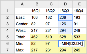
- Category: DatabaseAndFormsVariables, EditingAndContentUpdateVariables, FormattingAndRenderingVariables, TablesAndSpreadsheetsVariables
- Related: See TWikiSheetPlugin for more details (this topic)
TWISTY{ attributes } -- dynamically open and close sections of content
- The
%TWISTY{}%variable is handled by the TwistyPlugin. - Syntax:
%TWISTY{}% ... %ENDTWISTY% - See plugin topic for explanation of variables and attributes
- Example:
%TWISTY{}%
my twisty content
%ENDTWISTY% - Category: FormattingAndRenderingVariables, ApplicationsAndComponentsVariables
- Related: TwistyPlugin, TwistyContrib (this topic)
TWOCOLUMNS -- responsive two-column page layout
- Write
%TWOCOLUMNS% ...text... %ENDCOLUMNS%to get a page layout with two columns. The layout is responsive, e.g. it automatically adjusts to a single column (2 => 1) depending on the window width or screen width of the device used. The 300 pixels minimum width of a column determines the number of columns shown. Embedded images scale down automatically to the width of the screen if needed. - Syntax:
%TWOCOLUMNS% ... %ENDCOLUMNS% - Example: %TWOCOLUMNS% Lorem ipsum dolor sit amet, consectetur adipiscing elit. Sed viverra ante ac augue sagittis semper. Vestibulum sed urna quam. Phasellus eleifend dolor id dui dictum lobortis. Etiam enim erat, fermentum eget libero non, pretium vestibulum nisi. Nam eget nisi diam. Cras egestas, nibh a malesuada hendrerit, tellus turpis gravida dolor, at fermentum ipsum libero id eros. Mauris a nunc turpis. Fusce turpis dui, blandit nec maximus at, sagittis et arcu. Duis eros sapien, accumsan sed varius eget, elementum eu sapien. Nulla congue, nulla efficitur gravida porta, leo ex feugiat purus, sit amet sagittis leo arcu at magna. Pellentesque eleifend, libero quis consectetur tincidunt, orci ipsum scelerisque turpis, vulputate feugiat risus orci non odio. Integer id enim turpis. Cras et nisl quis massa ornare maximus id sit amet justo. Mauris at mi eget nisi imperdiet ullamcorper. %ENDCOLUMNS%
- Type: Preference variable - TWikiRenderingShortcut.
- Category: FormattingAndRenderingVariables
- Related: THREECOLUMNS, FOURCOLUMNS, ENDCOLUMNS, TWikiPreferences rendering shortcuts (this topic)
USERSIG -- show user signature with profile picture icon
- Syntax:
%USERSIG{WikiName}%or%USERSIG{WikiName - YYYY-MM-DD}% - The parameter can be either just the WikiName of a user, or by convention the WikiName followed by a dash and the date
- Example:
-- %USERSIG{TWikiGuest - 21 May 2026}% - Expands to:
-- %USERSIG{TWikiGuest - 21 May 2026}% - Category: EditingAndContentUpdateVariables, FormattingAndRenderingVariables, UsersAndAuthenticationVariables
- Related: BUBBLESIG, USERREPORT, UserList, UserReports (this topic)
WIP -- work in progress icon
- Type: Preference variable - TWikiRenderingShortcut.
- Syntax:
%WIP% - Expands to: %WIP%
- Category: FormattingAndRenderingVariables
- Related: H, I, ICON, M, N, P, Q, S, T, U, X, Y, TWikiDocGraphics (this topic)
Categories:
Administration, Applications & Components, Attachments & Files, Charting & Drawing, Database & Forms, Date & Time, Development, Editing & Content Update, Email & Notification, Export & Publishing, Formatting & Rendering, Import, Linking & Navigation, Searching & Listing, Security & Access Control, Skins & Templates, System Information, Tables & Spreadsheets, UI& Visualization, Users & Authentication, Workflow & Automation
 TWiki Web
 Users
Users Groups
 Index
Index Search
 Changes
 Notifications
 RSS Feed
 Statistics
 Preferences
 KAPS
KAPS |
|
 Copyright © by the contributing authors. All material on this collaboration platform is the property of the contributing authors.
 Ideas, requests, problems regarding TWiki? Send feedback
Note: Please contribute updates to this topic on TWiki.org at TWiki:TWiki.FormattingAndRenderingVariables